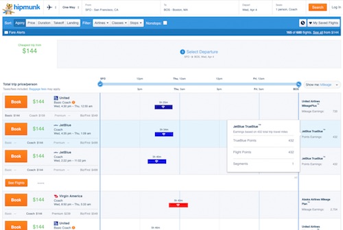
Hipmunk enhances flight search with features to make comparison easier
By cameron in Uncategorized
Hipmunk by Concur has redesigned its flight search interface to make comparison shopping easier, including sorting for the cabin and service features passengers want most. The results also show variants on features available by fares classes, to help travelers better judge the value of the ticket they book.
In addition to showing details on what fees policies apply to various fares tiers by each flight listing, the new Hipmunk flight search design adds a “Show Me” column which reveals passenger experience features available on each leg.
These include a new mileage earned feature that will appeal to frequent flyers as well as amenities offered (USB power, legroom, meals and on-demand entertainment); wifi availability (Whether it’s available, and whether there is a fee); Baggage allowance (checked and carry-on, and whether there is a fee); Aircraft type for each leg (showing number of seats per row, along with images of the aircraft interior). Hipmunk uses Routehappy amenities data, UPAs (universal product attributes) and UTAs (universal ticket attributes).
Adam Goldstein, Hipmunk co-founder and CEO explains the thinking behind the new user-friendly design:
“Travelers often choose a flight based on what’s displayed at the time of booking, only to find out when it’s too late that they can’t use the overhead bin. Now, Hipmunk has found a way to ensure every traveler knows exactly what they are getting—before they book.
“We’re proud of being able to show whatever flight information there is, even as airlines expand offerings.”
This level of search-detail and quality UX interface is a habit-forming convenience for passengers that helps simplify the sometimes taxing experience of flight shopping. We can expect that it will soon be a core expectation for travel shopping.
Related reading:
SAP-backed Concur acquires Hipmunk, in exit for the metasearch UX pioneer
![]()

