Five rules for creating effective landing pages on a travel website
By cameron in Uncategorized
When potential customers arrive on your landing pages, you want to make sure they don’t take off before making the most of what you have to offer.
In all facets of the travel sector, first impressions are everything. And a landing page is no different.
NB: This is an analysis by Seb Atkinson, search marketing manager at Selesti.
This is your brand’s departure lounge: it needs to provide your customers with a smooth transition to the rest of their online journey with you. Follow these five simple rules for travel site success…
1. Tailor offers to suit your audience
Customers are individuals, and they should be treated as such. An enticing landing page offer is a great way to draw people in, but only if the deal appeals to them.
Using customer demographics data, you can create user personas to match your offers to the right target markets.
By knowing what your customers are after and what makes them tick, you can align your deals accordingly, turning your landing page into a personalized shop window.
2. Be clear and concise
Form-filling apathy is real – barely a day goes by when some company or other isn’t asking for your name and address.
A clear incentive is key to overcoming this. Customers need to know exactly what they’ll get in exchange for their personal information – such as member-only access and rewards, newsletters and offers, or more attuned search results.
Remember, no one has time to wade through lengthy descriptions, but there is such a thing as being too brief.
If your customers have to ask “Why?” when it comes to completing your landing page form, you’re probably not communicating effectively – consider hiring a professional copywriter to get the point across and drive sign-ups.
3. Set the mood
Appealing to the senses is a great way to engage site visitors, and imagery plays a central role in inspiring and motivating them.
Whether you’re showcasing a stunning resort or capturing the thrill of an adrenaline-filled activity, this is the perfect place to hook potential customers by giving them a taste of what’s on offer.
Picturesque views, exotic destinations and luxurious accommodation are all good options for setting the mood.
Or why not try capturing all that and more in an action-packed video – this travel montage by Logan Dodds is a great example.
4. Demand less to get more
It can be tempting to ask site visitors to give you as much information as possible – but this is one situation where the idiom ‘less is more’ really rings true.
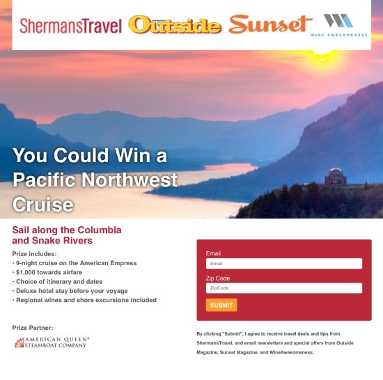
Take Sherman Travel’s landing page.
They only ask visitors to fill in two fields – email address and zip code – the minimum amount they need at this stage in the buyer’s journey.
A lengthy form can put many users off, even with an attractive offer or competition.

Not only are multiple fields time-consuming to fill out, they also can deter less trusting visitors to your site. If a user hasn’t heard of your brand before, they might be reluctant to give up their personal details.
Ask for the most relevant and useful information only if you want to see higher conversion rates.
5. Help customers find their way
The main aim of the landing page is a successfully completed form that redirects your customers to the next stage of their buying journey.
A clutter-free page provides clarity and encourages the user to fill in the form.
Other links, copy and menus only serve to draw your potential customers’ attention away from your primary objective. At which point they might never return.
That doesn’t mean the page has to be stark and unattractive – take a look at this great example from AardvarkCompare.
It offers just enough useful information and imagery to engage the customer, but other than the McAfee Security Certification, the only exit point on the page is for them to fill in the form to compare insurance plans.
Summing up
Striking a balance between tailored offers, engaging content, and effective forms can make all the difference to your conversion rates.
But follow these five rules for landing page success and you’re sure to see your stats soar.
NB: This is an analysis by Seb Atkinson, search marketing manager at Selesti.
![]()

