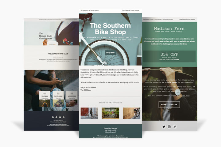
Designing Templates with Hero Images
By cameron in background images,email design,hero images,templates,Using MailChimp

In our latest release, we’ve added the ability to include background images in our basic templates. Background images are a simple way to add visual interest to your campaigns and promote brand consistency in your emails. Most importantly, they’re perfect for adding a hero section to your campaigns.
A hero section is a design technique that involves using images, short, compelling copy, and a call to action to make content more attention-grabbing. But there’s a lot to consider if you’re including hero sections in your email. In this post, we’ll explore some best practices that’ll help you get the most out of this exciting new feature.
Choosing an image
Oftentimes, the hardest part about adding a background image to a template is finding a photo that works well with your brand—and the type of content you’re sending. Here are some tips that will help:
- Images should be simple, and shouldn’t distract from the content of your email. For example, a photo of a landscape may work better than a visually busy pattern.
- Watch for the distribution of light and dark sections in an image, and keep in mind that your content might not be visible depending on the color of your text.
- If there are people in your images, make sure they aren’t awkwardly cropped or obscured on screens of different sizes.
- If you want an image to span the entire background of an email, it’s better to use high-res images. If you’re using images inside the body of your email, make sure they’re around 640 pixels wide.
If you’re not sure where to find high-res imagery, you can start by taking a look at great sites like unsplash.com and deathtothestockphoto.com. If you prefer to use a pattern instead, check out subtlepatterns.com and transparenttextures.com.
Adding content
Now that you have an image, the next step is to add your content. But there are some other design principles to keep in mind while doing so.
In sections where you’re adding background images, try to keep content short and sweet in order to avoid a fight for attention between your image and the copy. Try leaving some breathing room around your text, which will make copy more readable and allow the images to effectively shine.
Image and text colors also have an important role to play. When selecting font colors, be aware that, while a color may work well over one section of an image, it might be less readable on another. For example, using a light text color over an image with light colors can make your content impossible to read.
You should also choose a background color as a fallback for sections where you’re adding background images. This color will display in clients where images are off by default or don’t render. A good way to choose a fallback color is by taking a look at your image and selecting the most prevalent color you see. However, you should be sure to choose a background color that has a high level of contrast to the text color used in that section.
Rendering and limitations
Unfortunately, background images aren’t supported across all email clients. We’ve done what we can to offer support for as many clients as possible, but there are 2 notable clients in which background images will fail: Microsoft’s Outlook and outlook.com. If you use a background image in one of these clients, they’ll display your fallback background color instead of the image. Check out the composition of your list and, if you feel that you absolutely need background images in Outlook, you may want to look into building a custom template or reaching out to a MailChimp expert for help.
Background images can be tricky, so testing is absolutely necessary to ensure your design looks the way you want across the most important email clients in your list. Our Inbox Preview tool allows you to test on different email clients directly in the preview mode of your campaign.
For a more in-depth explanation of how to make the most of background images, visit our Knowledge Base.
Good luck and happy designing!

