How travel sites can minimise booking abandonment
By cameron in Uncategorized
This is a viewpoint by Graham Charlton, editor-in-chief for SaleCycle.
Booking abandonment is a problem for travel websites, but there’s still plenty they can do to keep the problem to a minimum. In this article, I’ll explore the issue and look at possible solutions.
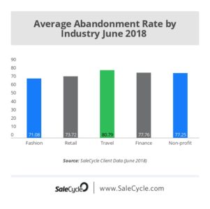
Travel sites have higher abandonment rates than any of the five sectors we monitor at SaleCycle. At almost 81%, it’s above the average of 76%, and nearly 10% higher than the rate for fashion retail sites.

So why are abandonment rates higher in travel? I think there are two main reasons:
A long and sometimes complex booking process
With the need to gather information from visitors on individual traveller details, passport numbers, the selection of seating, extras such as in-flight meals and so on, the booking process can become quite lengthy.
This makes it more likely that people will become frustrated and abandon the process.
A lengthy research process
Many travel purchases are relatively expensive for the booker, and require plenty of thought. According to Tripadvisor, 80% of travel research takes more than four weeks to complete. This means that people will visit several sites before making a final decision, perhaps starting and abandoning several bookings as they go.
For these reasons, there’ll always be a certain amount of booking abandonment. Customers want to take time to research, and travel websites need a certain amount of detail from customers to take bookings, so the process has to be relatively long in many cases.
We see sites with much lower than average booking abandonment rates, and this is because they address some of the issues which cause unnecessary abandonment.

Improve the booking process
Completing travel bookings is mainly about filling in forms, and this is where customers can become bogged down and potentially abandon the booking.
More user-friendly forms mean that more customers can get through the booking process without encountering problems that can lead to abandonment. A form may be long, but good design and a clear process can make it a more pleasant (or at least less frustrating) experience.
Forms should be tested on users to identify possible pain points, labels should indicate what information is required, input fields should be adapted according to the user’s device and type of data required (defaulting to numeric keyboard on mobile for payments for example), and feedback should be provided as users complete forms.
The challenge of mobile
Mobile presents another challenge for travel sites. According to our own data, mobile now accounts for more than 41% of all traffic to travel sites, but just over 18% of bookings.
This suggests that, while people are happy to browse and do some research on mobile, far fewer want to complete the transaction there. Most travel sites are now optimised for mobile, in the sense that they are responsive and adapted to the smaller screen to some degree.
However, providing a mobile experience goes deeper than that. For example, form fields, CTAs, and any clickable elements need to be designed for ‘fat fingers’ and given enough space so that fields and links aren’t too close together.
In addition, the booking process can be made easier on mobile with useful shortcuts which help with things like address entry and providing payment details.
For example, lastminute.com presents users with the smartphone’s numerical keyboard for appropriate form fields like birth dates and card numbers. It saves the user time and effort and thus reduces friction.

Help travellers to research holidays and prices
The majority of visitors to a travel site will not end up making a booking, but this doesn’t have to mean the visit was a failure. They may have simply checked prices and availability, but need a little time to think, or check with friends and family before booking
Travel sites need to realise this and do what they can to help customers. For example, clarity over pricing helps customers to make an informed decision, especially as some travel sites have been guilty in the past of adding ‘extras’ which bump up the final price.
Reviews are another way to help. Tripadvisor reaches a massive number of travel shoppers and forms a key part of the decision-making process, so it makes sense for sites to either host Tripadvisor reviews, or show their own reviews.
Sites can also remind users of booking details, by sending abandonment emails. When timed well, and using saved booking data, recovery emails like this can be a useful prompt to bring customers back to complete a booking.
Provide a choice of payment methods
A choice of payment options can help travel sites to appeal to a broader range of customers. While debit and credit card payments are still the most popular online payment methods in the UK, this isn’t the case everywhere.
PayPal is now a well-established alternative payment option, but others are growing in popularity – digital wallets, Amazon Checkout and more. Travel websites need to keep up with customer preferences change to avoid unnecessary abandonments.
In addition, some payment methods can help to improve the experience by streamlining the payment process. If customers use PayPal or newer methods such as Visa Checkout, then the process of entering address and payment details is reduced to simply entering a username and password, especially useful for mobile users.

In summary
In our recent report on the travel booking process, we estimate that almost $3 trillion in travel bookings will be abandoned in 2018.
For travel marketers, the challenge is to minimise booking abandonment rates by providing the best possible customer experience, and to recover as many abandoned bookings as they can.
This is a viewpoint by Graham Charlton, editor-in-chief for SaleCycle.
Opinions and views expressed by all guest contributors do not necessarily reflect those of tnooz, its writers, or its partners.
![]()