The ultimate guide to website design for hotels
By cameron in Uncategorized
“The art of design is to make complicated things simple”
~Tim Parsey
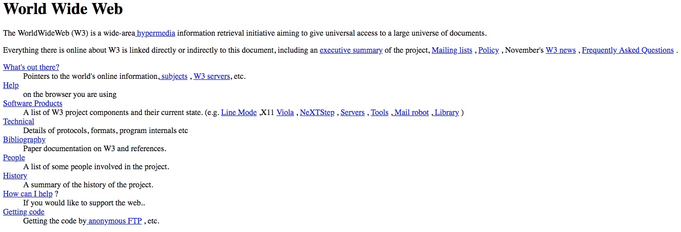
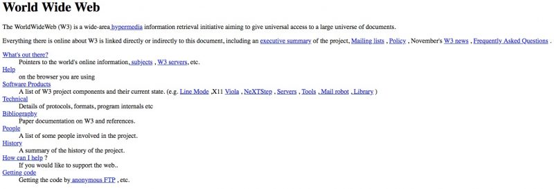
Although a webless world seems inconceivable today, the first website only dates back a quarter of a century. It was created by Tim Berners-Lee, at the time a simple researcher and independent contractor at CERN in Geneva. The site is still visible and accessible at this address and, even if it is just a simple white page with hyperlinks, it remains an essential piece of history for internet enthusiasts. Berners-Lee, among other things, is the mind behind the WorldWideWeb, the first browser (for Steve Job’s NeXT) and the original incarnation of the standard markup language for creating websites and web apps still in use today: HTML.
[click image for larger version]
Navigator and IE
To understand the context in which this digital art has evolved, it is necessary to retrace some important steps in the history of the web. The first “browser war” is one of them. In ’92, programmers Marc Andreessen and Eric Bina started to work on a project called Mosaic.
Released in ’93 (on Unix platforms), by the end of the year, the Mosaic browser was already compatible with Macintosh, Windows, and Amiga OS. Mosaic owes its great success to its portability: Unlike its predecessors, in fact, it was not a closed system, running exclusively on machines with Unix OS, and this quickly became a crucial feature for any future browser, during a time when the access to the internet was rapidly expanding beyond the academic, governmental and military fields to the homes of millions of families.
Mosaic was only dismissed when Andreessen founded Netscape and launched Navigator. Microsoft, surprisingly, recognized the real potential of the web relatively late, and its first browser (IE) was released in ’95. Nevertheless, Microsoft, with a smart and unorthodox move for the time, starting from the ’95 version of Windows OS, distributed IE as the default, pre-installed browser on all its computers, regaining a huge slice of the market.
Digital Babylon
What do browsers have to do with web design? A lot. IE and Navigator were programmed with proprietary languages, so they did not adhere to compatible, unique standards. This forced developers to code differently in order to correctly show their websites on the two browsers. This, obviously, limited the creativity of the designers profoundly. On top of that, developers, in an attempt to reduce costs, had to decide which browsers to support, creating a bad UX for some web users. Not to mention that the lack of a shared language meant having to learn different styles and coding techniques.
In order to solve this digital Babylon, in 1996, the W3C (a consortium of companies which aim to develop standards for the web founded by Berners-Lee) published the first CSS specifications. With CSS, coders were finally able to separate the content of a website from its formatting, without the constraints of websites’ underlying markup. WaSP, a group of web designers and developers formed in ’98 (and split in ’13) promoted extensively the W3C recommendations. And, although Microsoft and Netscape were not particularly enthusiastic about completely abandoning their proprietary approach, the WC3 guidelines eventually succeeded, with positive consequences both in terms of development costs and of accessibility.
The Dark Ages of web design
So, if on one the hand a common and standardized coding language facilitated the job of the developers, and helped to expand the limits of the web, on the other hand, this vaster openness also paved the way for a dangerous DIY approach. Websites started to be coded in teenagers’ rooms rather than professional design firms.
In ’97, even Microsoft Office Suite offered, along with its most popular Word, Excel and PowerPoint software, an HTML editor called FrontPage. Based on WYSIWYG technology (What You See Is What You Get), FrontPage made it possible for virtually anyone to create or modify web pages without any knowledge of HTML.
Despite an (undeniable) liberalization of the Net, this trend led to the invasion of thousands of websites filled with animated GIFs, biblical loading times, navigation difficulties and design inconsistencies. In short, a frustrating UX.
The web design renaissance
Next to this negative trend, however, a new professional design sensibility started to raise. Graphic innovations began to merge with the need for websites to achieve specific goals (selling a product, promoting an event, etc.). During this period, both designers and coders founded two important allies in their creativity: JavaScript (a system of scripting for the creation of dynamic effects, such as pop-ups or text animations, not achievable with static HTML only) and, above all, Macromedia Flash (later integrated into the Adobe Suite).
Gradually abandoned because of its instability, slowness, privacy concerns, and search engine difficulties to index websites created with this language (not to mention the infamous Steve Job’s “Thoughts on Flash” 2010 blog post), it is undeniable that, thanks to Flash, for the first time in the history of the web, developers could integrate elegant and complex multimedia animations, videos, audio files and dynamic text in their websites, unleashing the designers’ creativity, up until then confined within the limitations imposed by the staticity of HTML.
User-centric design
Another milestone in the history of web design has been the birth of MySpace and Facebook and the advent of social networks, at the beginning of the 21st century. The websites began to adapt to this new level of interactivity, and companies finally understood the importance of placing their users at the centre of the web experience.
If, up until that moment, designers and coders used to create aesthetically pleasing interfaces based merely on their clients’ requests, they then started moving to a more user-centric approach. Web research began to focus more and more on the study of websites usability, navigation fluidity and on the easiness of interaction.
We refer to this period as “Web 2.0”, eventhough it is plausibly misleading: the linearity of labels such as 1.0, 2.0, 3.0, makes sense when it comes to updated versions of specific software or OS, but the web evolution is rarely as linear as the one of an operating system.
Semantic issues, aside, with Web 2.0 we start talking about User Experience Design (UXD). UXD does not refer solely to the artistic process behind the creation of a website, but to the constant A/B tests, user behavior analysis, heatmaps monitoring, and so on. A UX Designer is essentially a hybrid figure between a creative artist, a project manager and an analyst whom, in addition to an arts education, has knowledge in broader fields such as sociology, anthropology, psychology and cognitive science as well.
The web goes mobile
Eventually, with a standardized coding language (or, more precisely, a mix of them) and a more defined role for designers, the second decade of the ’00s blossomed with hundreds of original, professional and creative websites. This Renaissance, however, had to come to terms with a new trend.
In 2015, for the first time in the history of the web, mobile traffic exceeded the desktop. The reasons are numerous: first of all, a mobile device is easily available in all those situations in which people do not have access to a laptop or a desktop. A second determining factor is the decreasing costs of mobile data traffic and roaming over the years. A third one can be the “Second Screen” phenomenon: according to Accenture, 87% of the adult population utilizes a second device (usually a mobile phone) while watching TV, playing with a console or working on a computer.
Another determining factor (especially amongst younger users) is the Fear of Missing Out (F.O.M.O.): a pathological anxiety status triggered when separated from one’s mobile phone or, as stated in the book “Computers in Human Behavior”, “a desire to remain constantly in touch with what others are doing”.
Therefore, now more than ever, not having a mobile-friendly website is no longer a risk that hoteliers can take. The infamous 2015 Google’s “Mobilegeddon”, moreover, has further highlighted the need for mobile-first web design approach.
mSite, app, responsive or adaptive
So, what should you do? mSites are prehistory, and apps are rarely advisable to hoteliers (except for larger chains and branded hotels). According to Google, in fact, 95% of apps are uninstalled within 30 days from their original download date. The best two options are adaptive (AWD) and responsive design (RWD).
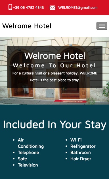
Adaptive design, as the name suggests, “adapts” to the screen and the size of the device used, while responsive “responds” to mobile devices by simply resizing the desktop version of the website to fit it into a smaller screen. It may seem like an insignificant difference, but it is far from it. Adaptive design responds with a different template, depending on whether you open a website from a desktop, a tablet or a smartphone.
Responsive design, on the other hand, will show you always the exact same template on all devices. Although it requires longer development times and larger investments, adaptive websites allow desktop and mobile strategies to be independent, as they should be. A mobile user would most likely look for basic information such as your phone number or your email address, and will not fully enjoy the emotional full-screen design of the desktop website version (and vice-versa).
No, I am not a webmaster
Now that we have quickly analyzed the past 25 years of web design history, let’s focus on what are the essential elements for the success of an ecommerce website. Let’s start by clearing the field from a hard-to-die myth: websites are NOT created by webmasters. A webmaster takes care of managing a website, but only after this has been put online. His scope is limited to tasks (such as the renewal of your domain or the resolution of a server problem) that have nothing to do with the creation of a website.
This semantic confusion has, over time, created hybrid professionals: part webmaster, part designer, part analyst. The greatest danger in relying on these jack-of-all-trades is that their competence on each field is (at best) superficial. The creation of a web project requires the collaboration of different experts, specialized in specific (and often very distant) areas. They are, usually, an analyst, a project manager, a designer and a coder.
How to build the perfect website. Phase I: analyse
An analyst is a professional with a thorough and verifiable knowledge of the industry for which the site is being created. In the case of hotels, it would be someone with both a background in the accommodation industry and in marketing. The main task of the analyst, in fact, is to study the hotel, understand its strengths and weaknesses, choose which one(s) need to be emphasized on the site and define the KPIs to monitor. A great way of doing this is by examining the property before even talking to the final client: first impressions are important and intuitive thinking, especially after years and years of experience in a particular field, has often an underrated importance on the creation of a correct strategy.
“when we become expert in something, our tastes grow more esoteric and complex”, wrote the Canadian author Malcolm Gladwell in his book “Blink: The Power of Thinking Without Thinking”, “there can be as much value in the blink of an eye as in months of rational analysis”.
Listening solely to the hotel’s requests can put the whole website project in jeopardy, as hoteliers, who spend most of their day in the confined space of the four walls of their hotels, tend to develop a “partial blindness”: they often take the stronger features of their hotel for granted and they give an unjustifiably high value to some trivial characteristic, so talking to the hotel owner should always be step II of the analysis process.
The analyst should then run a semantic analysis, to understand how the hotel is actually perceived by its guests. Once the three points of view (analyst, hotelier and guests) are aggregated, the analyst has a clear and complete idea of what should be promoted, and what not, in the final website. If, for example, the analyst had a great check-in experience but 90% of the reviews refer to the front office department in a negative context, it would be probably counterproductive choosing staff images on the website’s homepage, no matter the analyst’s first impression. That’s when this triangulation comes in handy.
How to build the perfect website. Phase II: manage
An implementation manager, or project manager, is the link between the analyst, the hotel owner and the designer. His or her job is to collect all the media necessary for the creation of the site (logos, media, brochures, PDFs and so on) and to compile a clear brief for the designer. This is a key moment: if the hotel, for example, gives a logo to the project manager, but with the wrong color palette, the designer will be working with incorrect reference points, compromising the final product. In some firms, especially smaller ones, the analyst and the project manager can be the same person.
How to build the perfect website. Phase III: design
It is only at this stage that the creative aspect kicks in. It is important to understand what a designer really is (and especially is not). First of all, there is a semantic misunderstanding here too: design has only partially to do with art and more with problem-solving. According to the Merriam Webster Dictionary, “to design” means “to plan and make something for a specific use or purpose”.
Design is, to put it straight, a solution to a problem. Asking a designer to “put a big red BOOK NOW button at the top”, or make your site “different”, is always the wrong approach. Designers do not need solutions, they need to know which problems need to be solved. Employing a designer simply to sketch in Photoshop what you think your website should look like, means denaturing the work. If you are not a designer, you probably have neither the skills nor the know-how to transform your vision (even if correct and coherent) into a functional website.
Operation!
Let’s use a metaphor: If you have a persistent cough (a problem), you go to the doctor (the designer) to look for a cure (a solution to your problem). If the doctor, after a careful examination (analysis), and specific examinations (implementation) prescribes you a syrup (design), I doubt that you would argue with him and decide to take a pill instead.
The will to be always right is intrinsic in the human nature, but would you risk your health because of your stubbornness? I don’t think so. Design works in the same way: if you go to a designer and give him a solution instead of a problem, then he will not be able to fix your problem, and that trivial cough could turn into something more serious (lower conversion, higher bounce rate, etc).
Obviously, once you receive the first design draft, there may be edits to be made, but the correct approach is always to make the designer understand the problem (“I forgot that I have to insert this bay leaf in the design because it is part of my brand identity” or “The revenue coming from MICE is increasing and I need to make it easy for companies to get all the info they need”), rather than suggesting a solution. Yours could be very good, but his or hers could (and usually is) be even better. As a designer will never have the arrogance to tell you how to manage your hotel or what rate strategy you should follow, likewise you should respect and trust the work of professionals you hired, try not to interfere and, above all, you should have a crystal clear idea of what you are trying to solve with your new website.
How to build the perfect website. Phase IV: code
Let’s debunk another myth: a web designer usually has no involvement in the creation of the actual code, and has only a rudimentary knowledge of coding. A web designer has an arts education, is a creative type of person and their work involves Photoshop and Illustrator rather than Python.
Although having a basic understanding of the main coding languages can help, as a general rule “Designers Should Design and Coders Should Code”, as stated in the “Interaction Design Best Practices: Mastering the Tangibles” book. Likewise, a coder has not artistic education (if any, he has a mathematical one) and does not deal with design. The skills of a coder are related to his knowledge of scripting languages such as PHP, Ruby or Python rather than Photoshop or Google Analytics.

Themes and templates
In recent years there has been an explosion of simple pre-designed templates ready to be implemented, or even futuristic products such as The Grid that, fuelled by artificial intelligence, allows you to create a complete website without the need for any human intervention. However, although a $50 template can be graphically pleasing and have a professional look, it obviously does not always meet the specific needs of a hotel.
This does not mean that your small B&B should necessarily have a $100,000 website, but if you want your brand experience to be unique, so your website should be. Moreover, web design, like any other form of art, is sensitive to trends, so the concept of “beautiful” and “ugly” becomes absolutely secondary compared to the website final purpose (increasing bookings), all aspects that a theme cannot guarantee.
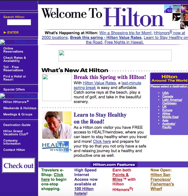
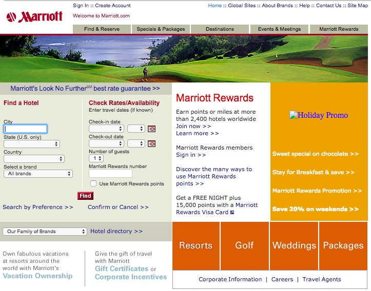
A multitude of design trends has come and passed over the years, often conditioned by external technology innovations, such as the birth of social media or the first iPhone. From the 90’s guest counters and solitary guestbooks to skeuomorphism, from flat design to parallax scrolling, the core of any good website has always been and will always be the user experience.
If everything is important then nothing is important
Remember that a website never creates traffic, just conversion. More than 90% of your future guests will land on your website after having found you somewhere else (an OTA, a review site, a metasearch engine, etc.), so they will already know about your location, your reputation, and your rates.
There is absolutely no need to explain to these users who you are, because they already know. And even if you’d wanted to, several studies state that users judge the beauty of a site in 1/50 of a second, and you cannot “inform” in 1/50 of a second.
The human brain, in fact, needs around 40 milliseconds just to read a single word, while it can process easily visual information in just 10. That is why you can (and you should) delete that bulk pile of text from your homepage and replace it with a big, emotional, full-screen photo/video right now.
Another thing you may want to avoid is confusion and anxiety status in those who visit your site. A hint of anatomy is needed to better understand this subject: in humans, the retina converts visual information into electrical impulses, these impulses are then sent to the photoreceptors, which transmit color and light information to the brain. The more colors and variations are present on a web page, the greater the amount of work the retina has to endure to send the correct stimuli to the brain (in design, this is called visual complexity), creating a state of anxiety and confusion. You may be tempted to put everything on the home page to give “more visibility”, but remember that, if everything is important, then nothing is.
As Occam would say, therefore, with the same factors, always favor the simplest solution. In his book “The Paradox of Choice“, Barry Schwartz scientifically demonstrates how excessive choice makes you dissatisfied. Iyengar and Lepper (respectively Professors at Columbia and Stanford Universities) are of the same opinion, and their “choice overload hypothesis” is a classic in cognitive science and psychology.
The basic elements of a great design
One of the key points of web design is the concept of “Emphasis” or “Hierarchy”. You should give a preferential place to what is important (the BOOK NOW button, for example) instead of burying your main call-to-action among dozens of less important tabs and buttons.
Remember that, in web design, every element has a “weight” and occupies a well-defined space. Balancing all the elements correctly within a page means having an easily navigable site. On the other hand, altering this balance leads to an inevitable imbalance, with catastrophic effects on the UX.
Other key elements in design are the notion of “repetition” (of colors, shapes and other visual elements helping increasing the brand consistency), “alignment” (it ensures that your design remains clean, without unnecessary stress on focal points) and “familiarity”. According to the UX researcher Colleen Roller, in fact, “familiarity is a strong motivator of human behavior. In general, people like things that are familiar because they don’t require as much mental work as things that are new and different do. Familiarity is attractive because familiar things require only limited cognitive resources and feel easy.”
Heatmaps and UX
When it comes to creating your website, the best is to rely on a design firm that deals exclusively with hotels, possibly with a known name and a verifiable background. Good design is the result of years of A/B testing, analysis, and benchmarks, so a company with hundreds of hotel websites to its credit will certainly have more data available than a more generalistic firm. However, if you want to start to learn more about UX, there are some simple tools to use and install that allow virtually everyone to understand what is working and what is not on your website.
Assuming that you are already tracking users behavior on Google Analytics, another powerful tool is the study of the heatmaps. Heatmaps, in fact, allow you to monitor what users do when on your website: where they click (click maps), where they move their mouse/trackpad (hover maps) and how much they page-scroll (scroll maps). Most of the heatmaps generator tools on the market, moreover, offer an integrated video-recording function as well, a feature of great interest in order to understand if the UX on your website is fluid and clear and, if it’s not, why.

United colors
Choosing the right colors to use on your website is a complex process and it would take a whole book to explain all the various implications. A bad contrast between background and text, for example, can create a frustrating UX navigation, so choosing colors based on personal aesthetic taste only is not enough to guarantee a good result. Colors interaction is a precise science, well known by designers. You may want to google “Chromatic Circle” or “Circle of Itten” to better understand how colors interact with each other, but the advice is always to rely on experts. Obviously, if a hotel has a precise graphic identity to respect, the designers will have to stick with it, but never at the expense of the usability of the site. Personal tastes aside, in fact, each color has unique and well-defined properties, characteristics and connotations, and they are extremely important, especially if you think that over 90% of our product evaluation is based on color alone. Not sure? Look at this color palette and name the first website that comes to mind.
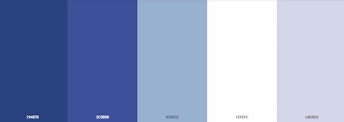
Have you thought about Facebook? If yes, you have confirmed the statistical data. Much has been written about the use of colors on the web, but one of the best books to start with is, probably “The Web Designer’s Idea Book Volume I” by Patrick McNeil. In the book, McNeil divides the colors based on what they symbolize and what connotations they have, providing real websites examples. If you want to understand the basic principles of colors in web design, then McNeil’s book is a great start.
Do I really need a website?
The answer is “it depends”. Creating a proper website with a scientific approach requires a significant investment, both in terms of time and money. Consider a range between €100-€200 per hour if you want to hire a good firm. And this only for the creation of the website, without including the investment needed for a performing hosting, content delivery network provider, SEO, SEA, and so on.
If you get a website for just a few thousand Euro, know that one (or, more likely, more than one) of the “experts” involved are, very likely, not so expert. Does this mean that if you have a tight budget, all hope is lost? Not necessarily, but, in this case, it may be a good idea to go for a pre-designed theme. Within certain limits, in fact, the difference between a €100 site and a €3,000 one is almost nil. When you decide to create or renew your website, the question should always be: what will my booking cost per acquisition be? Remember that no reservation comes without a cost, not even a direct one. If the cost of creating and maintaining a website for two years (average lifespan of a website) is equal to or even higher than OTAs commission for the same period of time, is it really worth it?
Remember that we are far from the times when a simple HTML page and a contact form were enough to receive bookings. The advice is to accurately analyze all the investments related to the website (including paid marketing actions) and figure the real impact in terms of cost per acquisition out. If a direct booking has a CPA higher than your average commission, then transferring your whole distribution to third-parties could be the easiest and more profitable option.
Conclusion
The goal of this article was to provide some basic concept in order to understand what “creation of a website” really means, and to debunk some myths and misconceptions about web design. It goes without saying that hoteliers should continue being hoteliers, rather than designers or developers, but at least a rudimentary understanding of a central marketing tool such as the official website, is necessary to consciously decide how and where to invest. And how and where not to.
![]()


